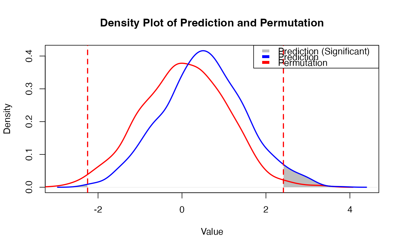
Visualizes the density distribution of prediction scores in comparison to a null distribution
(e.g., from permutation), and highlights statistically significant regions based on a two-tailed
threshold. This is useful for visually identifying predictions that deviate meaningfully
from chance expectation.
Usage
ThresholdPlot(prediction, permutation, p = 0.01)
Arguments
- prediction
A numeric vector of predicted scores.
- permutation
A numeric vector representing the null distribution (e.g., scores from permutations).
- p
Numeric, the significance level for defining extreme regions (two-tailed). Default is 0.01.
Value
No return value. This function generates a base R plot showing the density curves
of the prediction and permutation distributions, with shaded areas representing values
beyond the significance thresholds.
Examples
set.seed(123)
pred <- rnorm(1000, mean = 0.5)
perm <- rnorm(1000)
ThresholdPlot(prediction = pred, permutation = perm, p = 0.01)